Desert Island Stitch: Pretty Hate Machine
Nine Inch Nails is one of the few bands that has followed me through life. As a band, they continue to evolve and change [there is even a second full time member now]. There are quite a few album options that speak so clearly to parts of my life. Whether it’s the “Broken” EP that helped me get through the struggle of coming out, or the concept album “Year Zero” which was so pointedly critical of the Bush administration [I’m waiting for a redux called “Sub-Zero” as a commentary on our current administration].
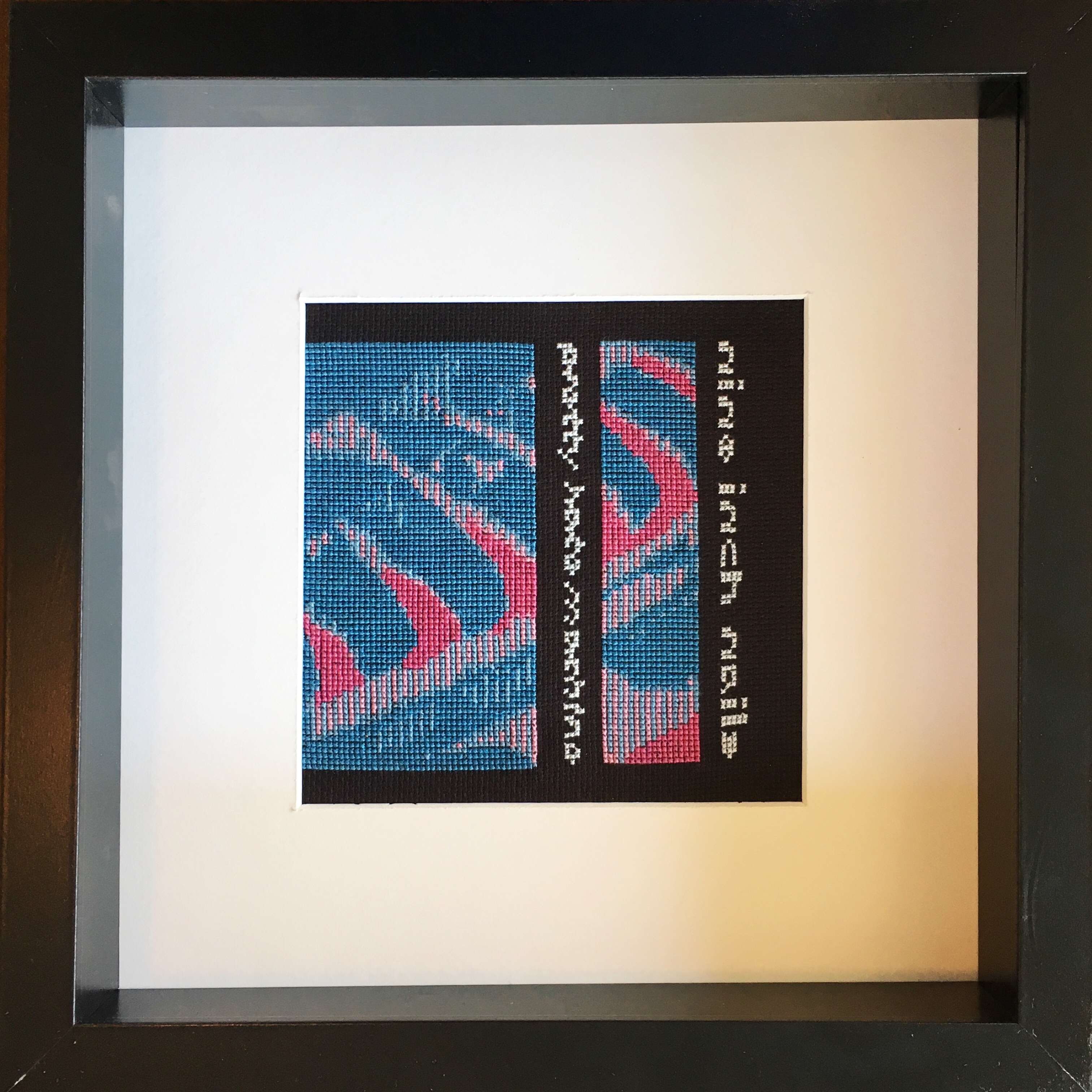
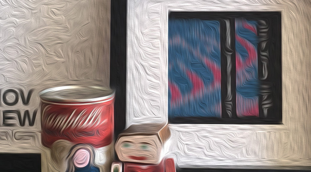
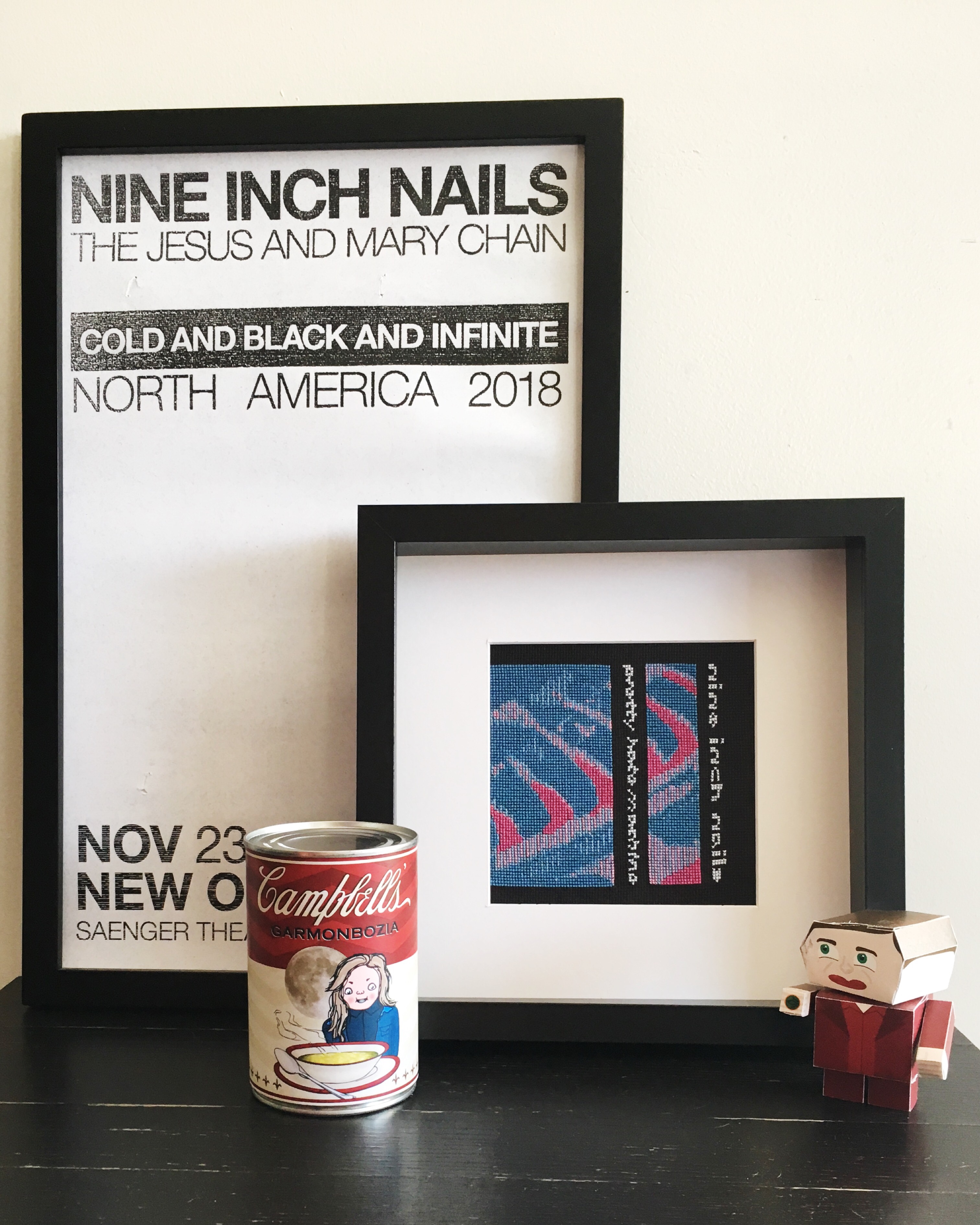
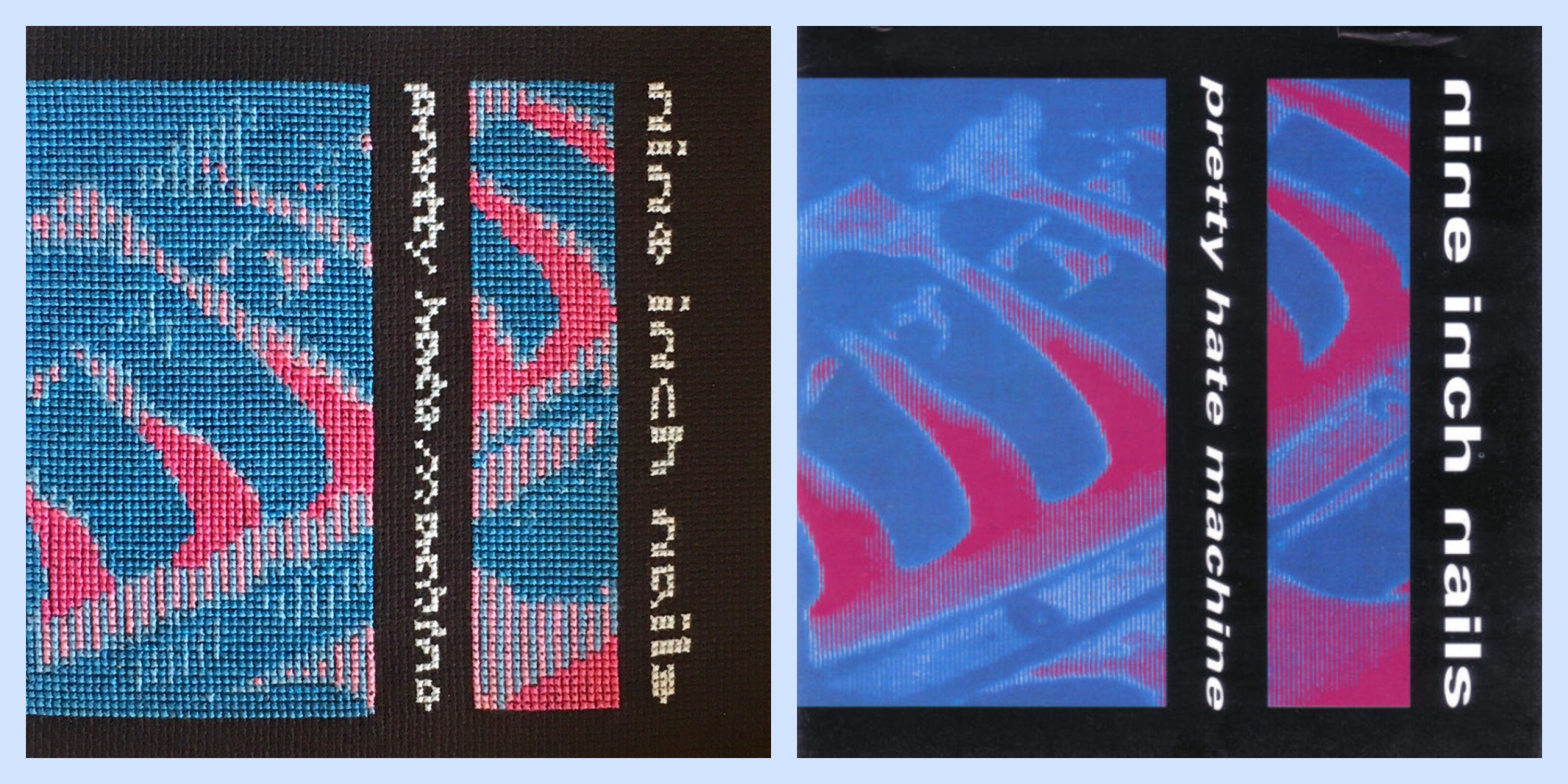
I finally settled on “Pretty Hate Machine” for the fourth in the Desert Island Stitch series. It was one of those albums that dug itself into my soul the very first listen. Of course I went with the original CD cover design rather than the 2010 remaster. I think Rob Sheridan did a great job rebuilding the image, as Gary Talpas’ original design files were lost, but I love that hot pink in the original.
The cover image appears to have been run through some heavy processing, and the color saturation adds a strange effect similar to low-end video equipment capturing a hot light. The challenge here was how to interpret that digital feel on something so completely analog… aka: thread.
I’m super pleased with the final result, even if Trent wanted to get rid of the pink. Let me know what you think in the comments below!