Browsed by
Category: Craft

Desert Island Stitch: Twin Peaks

Desert Island Stitch: Twin Peaks

“God I love this music… isn’t it too dreamy?” Audrey Horne says to Donna. She then slides away from the counter and begins to dreamily sway in the middle of the Double R while Donna looks on, smiling, though feeling a little confused.

Twin Peaks Desert Island Stitch

A little bit of a curve ball here with Desert Island Stitch number ten! Who would have guessed a soundtrack to a television series? The music of Twin Peaks is a portal that transports you to a strange little town filled with both darkness and light. It’s getting lost in the pines… it’s a lazy Sunday afternoon… and most importantly, it’s too dreamy. The series is iconic for a million reasons, but near the top of that list is Angelo Badalamenti’s moving score. Welcome to Twin Peaks, population 51,201.

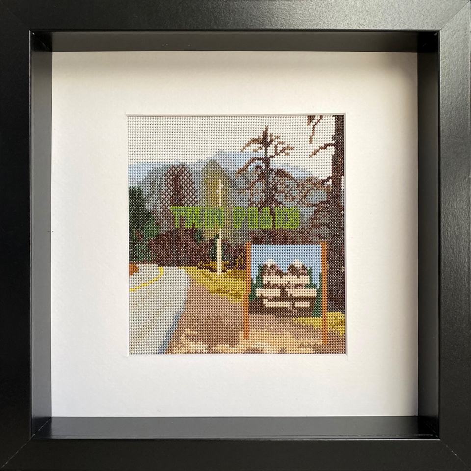
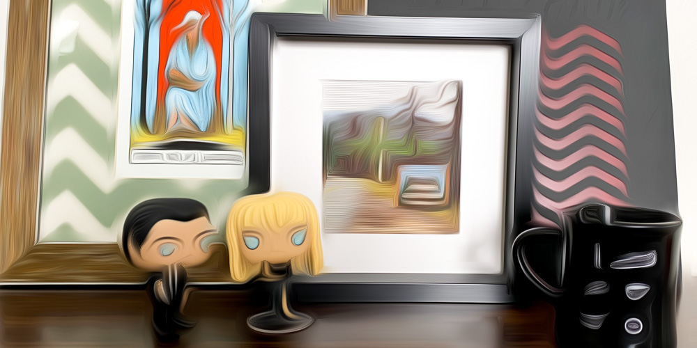
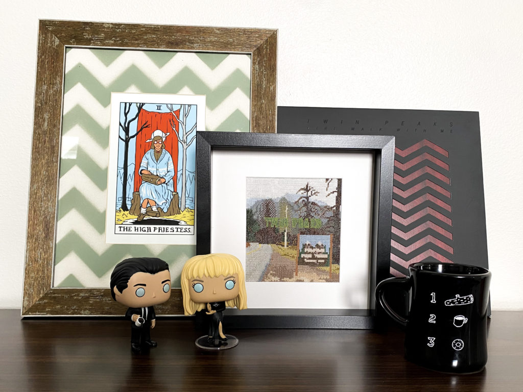
There are a ton of various re-issues and special editions of the soundtrack out there [the ones issued by Mondo are simply gorgeous], but I went with the tried and true original cover. The shot of an empty road leading into the damp woods, a mist hanging over the distant mountain peaks.

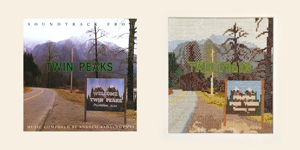
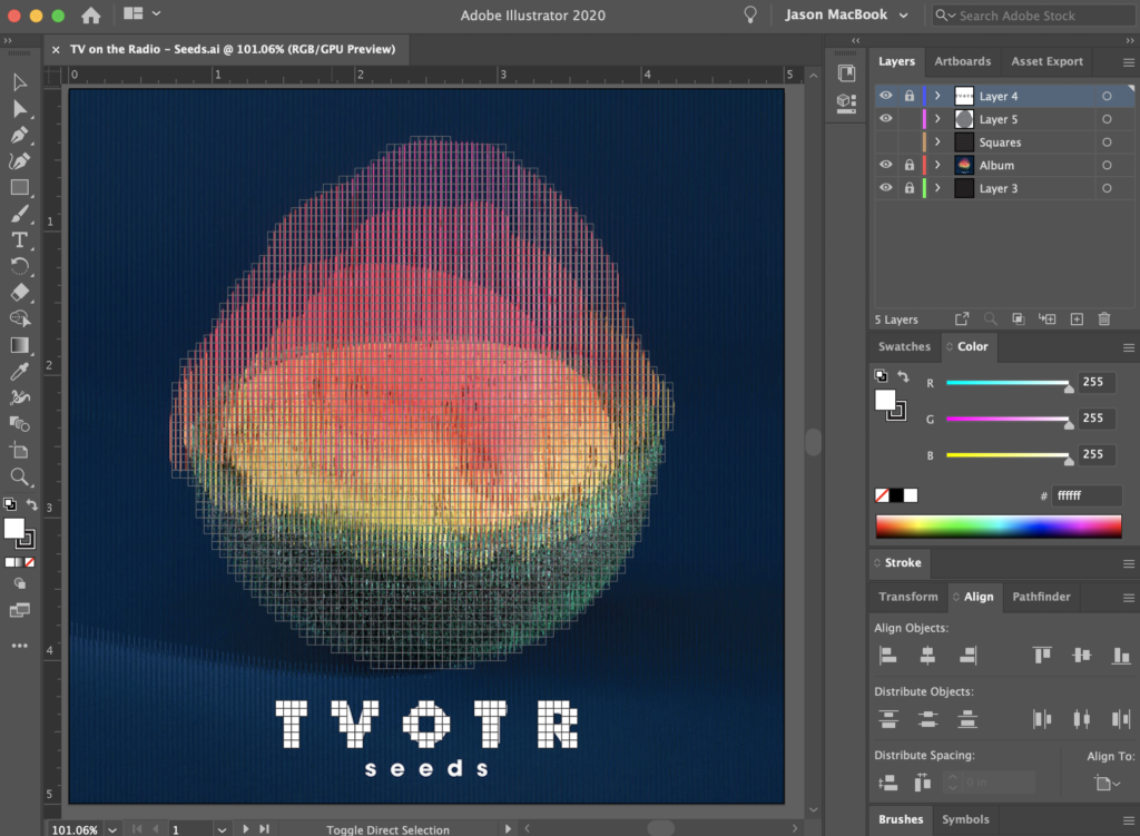
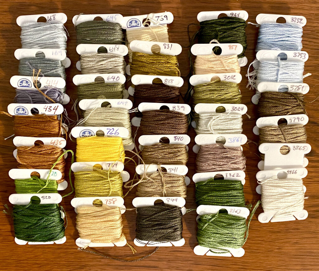
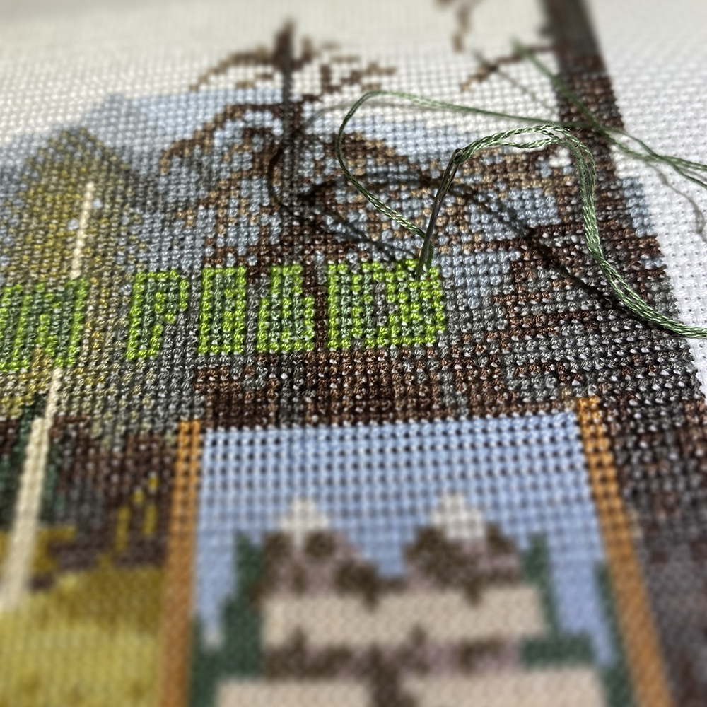
When I stated this piece, I had no idea how it was going to turn out. About a quarter of the way through I wasn’t happy with how the colors were looking, so I scratched the whole thing and started over with a complete redesign. Of course there was no way that I was going to be able to mimic the cover exactly, especially given the size and color limitation. Even then, I used a total of 34 different colors, giving this piece the most color detail out of all the Desert Island Stitch pieces. Though it still retains that lovely 8-bit look and feel, but with thread.

Cross Stitch Floss Colors for Twin Peaks Soundtrack
… this piece took exactly this many colors… 34… that’s the answer… 34 colors…

When I started this project over three years ago, I wasn’t quite sure where it would take me. I had a rough outline of where I wanted to go but I wasn’t sure how it would materialize. “Would I be able to really translate 10 iconic album covers into thread in such a way that they’re still recognizable?” Turns out, the answer is “Yes.”

The Final Stitch

Thanks for taking this journey with me! Let me know what you think in the comments… or share what your ten Desert Island Discs would be…

Honorable Mention

Honorable Mention

As I finish up the final “Desert Island Stitch” piece, I wanted to acknowledge the pieces that almost were… the ones that just didn’t quite make the top ten cut… because those are the rules, you only get 10 albums to take with you to your desert island… no mention of a record player, but I assume that’s in the fine print somewhere… anywho… in no particular order, all that could have been [which was not one of the pieces… see what I did there?]

Massive Attack “Mezzanine”

This is, without a doubt, a fantastic album… I did even hint at the possibility early on in the series of doing this album. Then finally being able to see them live in 2019 [literally the last concert I was able to see, thanks COVID] was beyond amazing!

[… yeah yeah, I just posted this on Twitter… Instagram is lousy for embeds… ]

Ultimately I decided against it because I thought the color palette would look too similar to the New Order “Low-Life” piece.

TV on the Radio “Seeds”

This one I actually started designing, its such a great album, their best as far as I’m concerned. The plan was to use a glossy thread to give the rock image a bit of shine. Though the vertical black lines were there to give it a strobe effect when you remove the slip cover, my intent was to just pretend they weren’t there.

The challenge was going to be whether or not I could find enough shades of the glossy thread to create the slight changes in the colors on the rock. I was waffling on how to proceed when I changed direction all together.

The Horrors “Primary Colors”

The first time I heard their song “Sea Within a Sea” I was mesmerized. Seriously, it’s a journey.

[… lawrd… how is this eleven years on now…?]

This album was always floating around as a possibility, but graphically speaking, the cover itself is a bit plain. A blurry sepia tone shot of band. I really wanted to include a cover that was more recent [granted it’s just one year younger than Santigold’s self titled] but my heart was never in love with the cover image. I considered doing their album “V” as an alternative, because that album is so damn good too, but nixed that because the detail was too small and wouldn’t translate enough to the 18 point aida.

… and there you have it…

Its not to say that I won’t ever circle back around and give one of these a go, but when I initially started this project three [!] years ago, I told myself the number would be ten, because like I said, those are the rules of the Desert Island Disc.

What album covers would you have liked to see? Drop a comment…