Protest-Bot
So this post has been a long time coming. Two years ago I created the “Protest-Bot” as a way to channel my surprise at the surge of intolerance and willful ignorance. He carries a simple placard with several different colored cogs spinning together. Remove one of those cogs, and the system stop working. These multicolored cogs working in unison represent how I was brought up. We are all different, and we are all in this together.
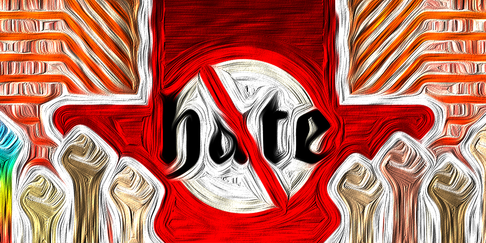
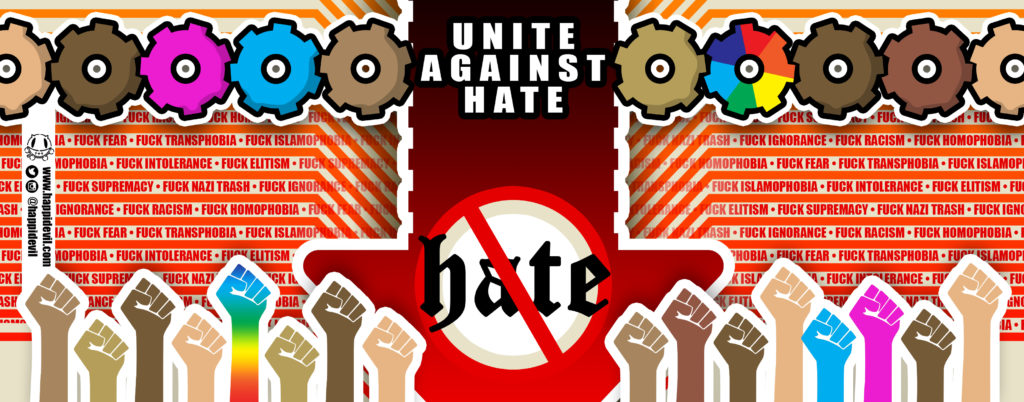
Late last year, I felt the need to step up the message a bit. As with the my other bot designs, I decided that Protest-Bot needed his own special label. The design was inspired by the modern philosopher Karl Popper and his “paradox of tolerance.”
If we extend unlimited tolerance even to those who are intolerant, if we are not prepared to defend a tolerant society against the onslaught of the intolerant, then the tolerant will be destroyed, and tolerance with them. — In this formulation, I do not imply, for instance, that we should always suppress the utterance of intolerant philosophies; as long as we can counter them by rational argument and keep them in check by public opinion, suppression would certainly be unwise. But we should claim the right to suppress them if necessary even by force; for it may easily turn out that they are not prepared to meet us on the level of rational argument, but begin by denouncing all argument; they may forbid their followers to listen to rational argument, because it is deceptive, and teach them to answer arguments by the use of their fists or pistols. We should therefore claim, in the name of tolerance, the right not to tolerate the intolerant.
The Open Society and Its Enemies Vol. 1
Or if you need it in digestible meme form:

With this in mind, I moved the cogs in a row. They are still working together, but now they work in unison to actively push down hate. Along the bottom I added in are multicolored fists rising up in defiance of intolerance. Though this image may seem aggressive or combative, I feel that it is crucial that we stress the importance of not being passive, as hate speech is on the rise.
With the label designed, I then wrap it around a can containing a cute little paper robot, and leave them out as free art. After all, who doesn’t love free art, and who doesn’t love cute little robots?
If that none of this resonates with you, maybe this short film produced 72 years ago will put it into perspective. Don’t have time to watch the whole thing? Jump to the 2:20 mark and tell me that isn’t the exact type of vitriol being spewed today. They are trying to divide us. We cannot let that happen.
“… We must never let ourselves be divided by race or color or religion, because in this country we all belong to minority groups…”
