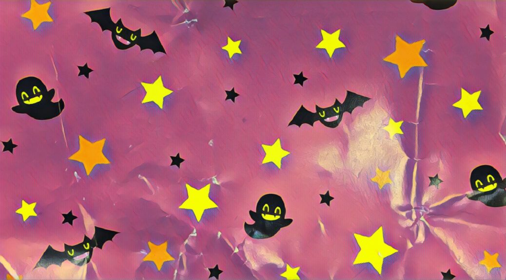
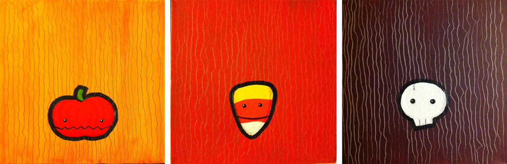
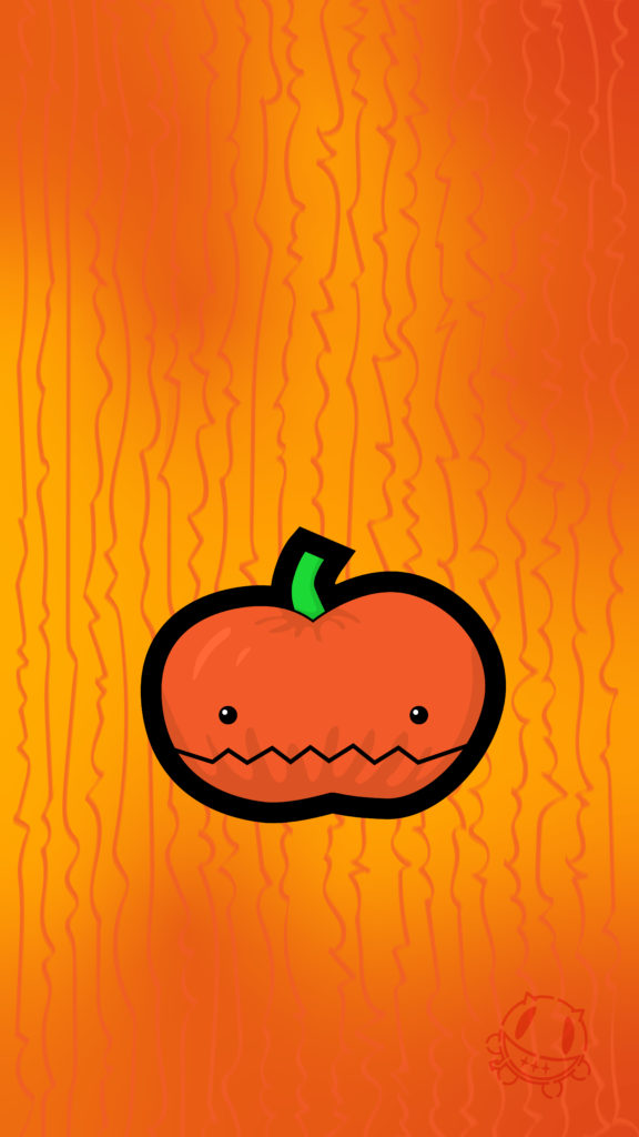
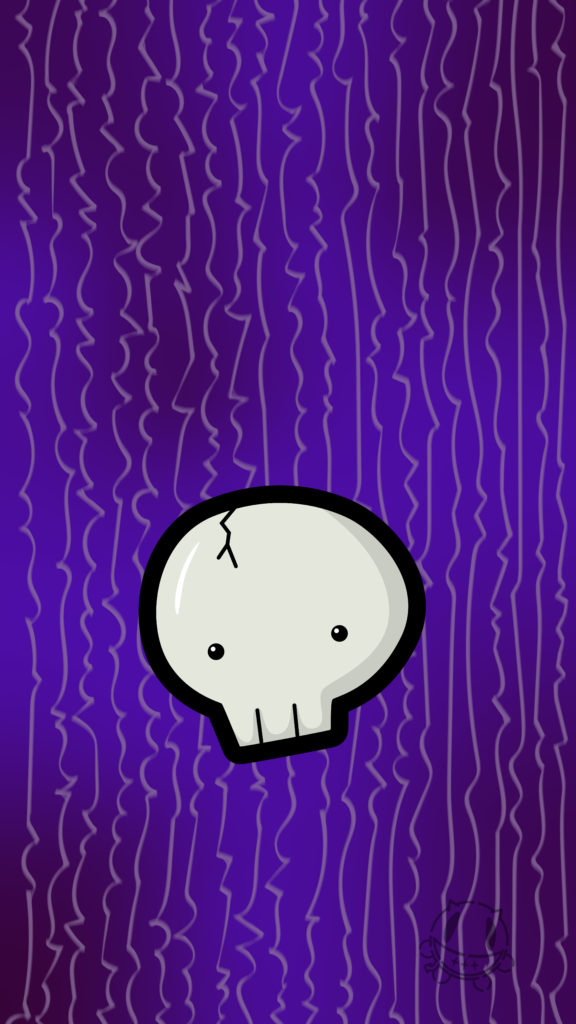
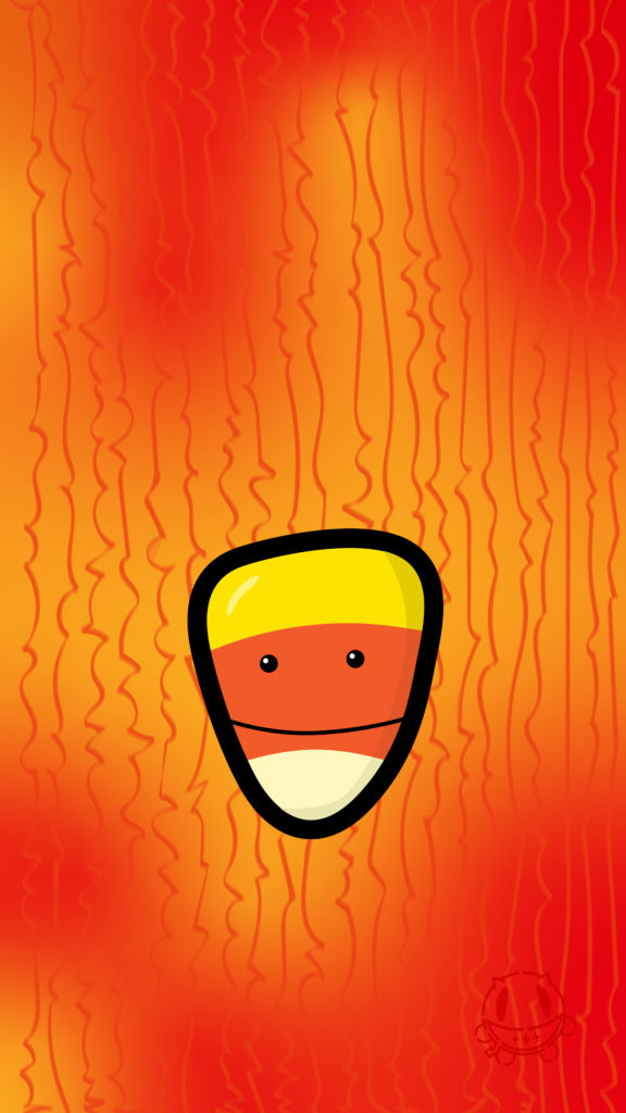
I was flipping through Timehop and was reminded of some cute little Halloween paintings I created a few years back and thought they’d make cute phone wallpaper.
Halloweenies
Unfortunately the size was a bit wonky, since the original paintings were square. So I says to myself, “Self, why don’t you just make a little vector version that you can size up to 1080×1920? And then why don’t you take those and post them for everyone to use!”
And here we are! So please enjoy… and Happi Halloween!
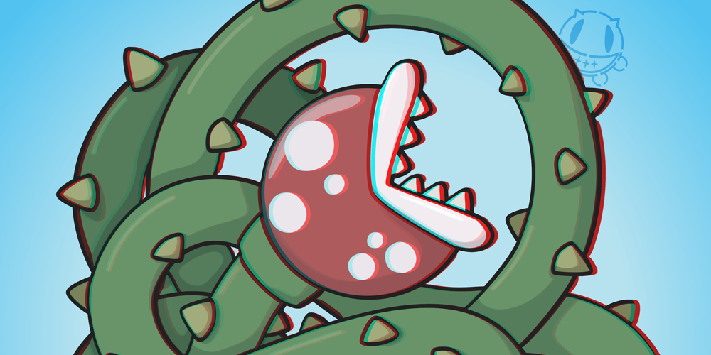
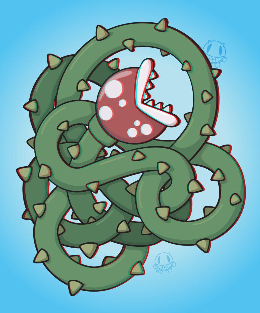
A few months ago I had read a post on Boing Boing about adding depth to a graphic illustration by turning it into an anaglyph. It seemed super fun, so naturally I wanted to give it a whirl.
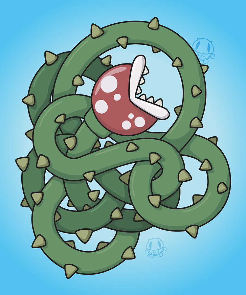
I had this illustration that I created a while back and thought it would look cool with some depth.
Of course this particular image has a bunch of inherent challenges with the vines twisting back around and through themselves, mixing up the plane of depth [or z-axis if you want to be technical]. So why not start with something simple? Because I’m just extra like that sometimes. Anywho… I popped on to Amazon and ordered up some Red-Blue 3D specs and gave it a go.
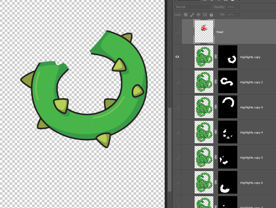
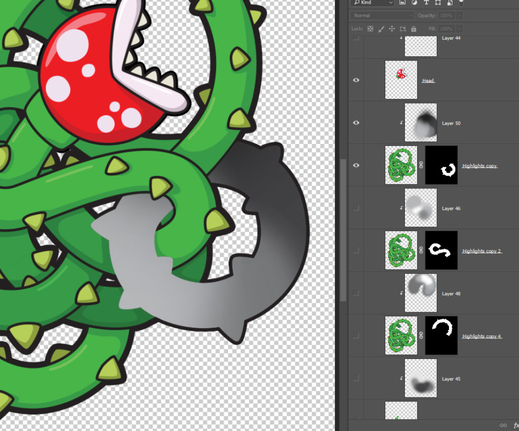
Step One: This is the tedious step. Mask out each piece of the artwork based on the depth of it. Things that would be on the same plane of focus would be masked up on their own layer, as seen in the picture below. Technically I could have imported the Illustrator file [with layers], but again, since I have vines twisting around I went this route.
Step One
Step Two: Creating the greyscale. The depth in the photo is going to be simulated through greyscale, where solid white is the foreground and black is the the absolute back. Shades of grey would create the illusion of depth. I broke from the instructions here and prepared my file a little differently. I used my masked sections as clipping masks to the shades of grey above them. This way it was easier for me to play with the colors without having to backtrack and recreate a lot of steps. Allowing me to make adjustments easier and quicker.
Step Two
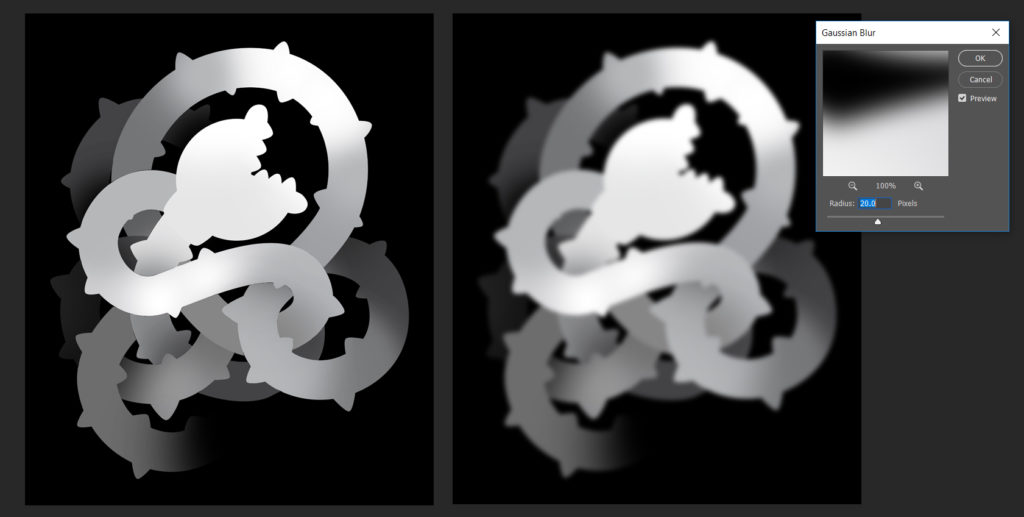
Step Three: Create the displacement. So once you have everything all greyed up to indicate depth, flatten the layers [Side-Tip: duplicate all your layers and then flatten that. That way you still have all of those editable layers in case you need to make adjustments], and add a Gaussian Blur. I did some playing here, and used variations between 10 and 20, where 20 seems to give a more extreme depth. This step is used to sort of soften the edges. Save As “whateverfilenameyouwant-displace.psd”
Step Three – Left side shows the flat greyscale version; Right side shows with Gaussian Blur
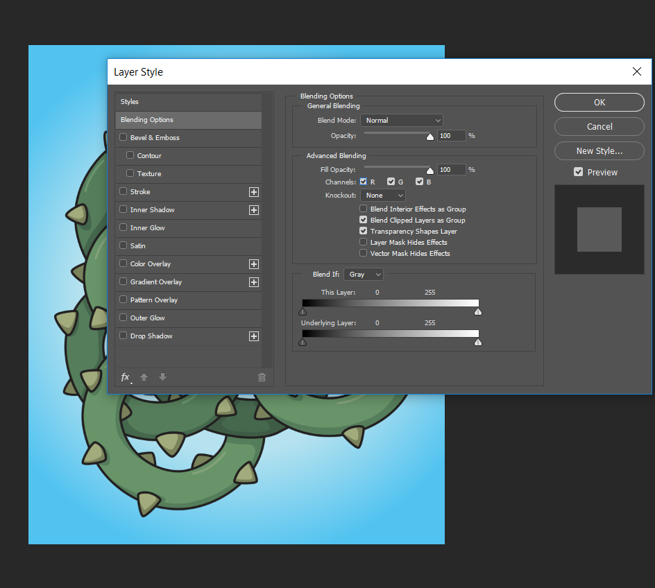
Step Four: Open the source artwork. Reopen the original artwork, all merged onto one layer. Duplicate the layer. Double click the top layer to pull up the Layer Style panel. Under “Advanced Blending” uncheck the RED channel, and OK. Then do the same for the layer below, but on this one uncheck BLUE and GREEN channels.
Step Four
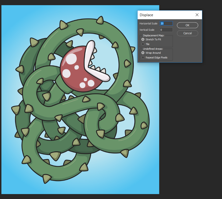
Step Five: Apply Displacement. Select the top layer again, then in the menu bar select Filter > Distort > Displace. Again, like with the Gaussian Blue, I did some experimenting with the numbers here, and it seemed like they work best when they match [20 Gaussian Blur, so 20 Horizontal Scale, 0 for vertical]. Hit OK, and then you’ll be prompted to locate a file to apply. Navigate back to where you saved “whateverfilenameyouwant-displace.psd”